
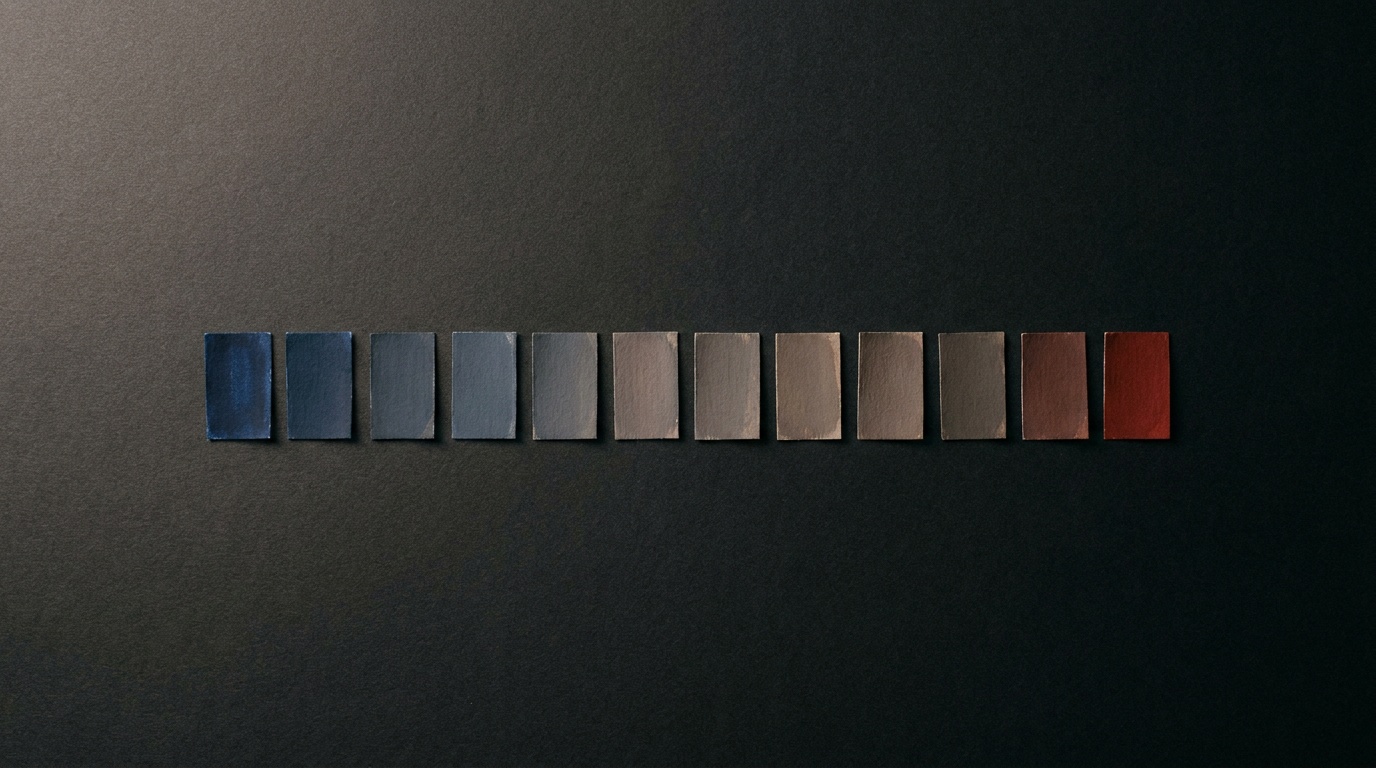

In March, Estúdio Âmbar sent us a Figma file for a restaurant client called Mariposa. It had 42 layers in the cover frame alone, three typefaces, and 142 colour styles with names like “Warm 3”, “Warm 3 copy”, and “Warm 3 copy FINAL”. Our job was to turn it into a WordPress site in four weeks. The first thing we did wasn’t open our code editor. It was open a spreadsheet.
The File we Was Handed
Rita Coelho, the designer on the project, works the way a lot of good designers work: she styles by eye, not by system. She’ll nudge an orange from #E8793C to #E87A3D because it feels warmer next to a particular photo, and she won’t necessarily remember she did it. That’s fine for a mockup. It’s a problem for a stylesheet, because a browser doesn’t know the difference between an intentional decision and a Tuesday-afternoon accident.
What the designer actually meant
So before touching code, we booked a 30-minute call and went through every colour style with her, asking one question each time: “is this a different colour, or the same colour used differently?” Out of 142 styles, 9 turned out to be distinct. The rest were duplicates, hex typos, or states (hover, disabled, pressed) that belonged to the same underlying value. That call did more for the final site than any amount of CSS refactoring could have.
Naming Things Before Styling Them
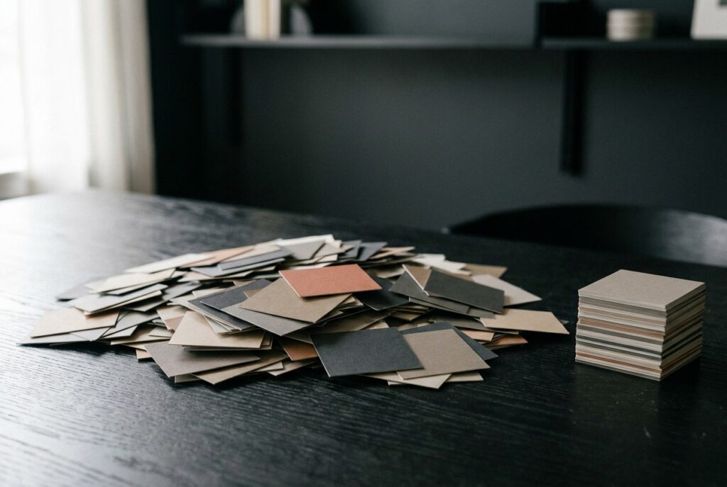
Once we agreed on the 9 real colours, we added 3 more for things the design hadn’t made explicit yet: a focus-ring colour for accessibility, a border colour slightly darker than the background, and a muted text colour for captions. Twelve total. We named them for what they do, not what they look like: --color-surface, --color-accent, --color-text-muted, rather than --color-orange-2. A designer might reasonably swap the accent from orange to teal next year. A name describing its job survives that change; a name describing its hue doesn’t.
The token sheet
We built a single Google Sheet with four columns: token name, hex value, where it’s used, and who approved it. It sounds bureaucratic for a 14-page restaurant site, but it meant that three weeks later, when Rita asked why the footer background looked “slightly off”, we could answer in one sentence instead of re-opening Figma to compare pixels.
- 9 brand colours, reduced from 142 named styles
- 3 functional colours added during build (focus, border, muted text)
- 2 font families kept, 1 dropped (a condensed display face used on exactly one slide)
- 4 spacing values, replacing 11 inconsistent paddings found across the frames
From Tokens to Tailwind, Then to Theme.json
The site runs on WordPress with a block theme, so the tokens had to live in two places: a Tailwind config for the custom blocks we were writing, and theme.json for anything editable in the native block editor. We wrote the twelve values once, in a plain JSON file, then generated both from that source with a ten-line Node script. It’s not an elegant build pipeline. It’s a script we run manually when a value changes, which for a project this size happens maybe twice a month.
Where it broke
The first version failed quietly. Tailwind’s JIT compiler didn’t pick up colour classes referenced only inside theme.json palette definitions, so three buttons rendered in a default grey instead of the accent orange. Nothing threw an error. It just looked wrong, and it looked wrong in a way that’s easy to miss if you’re not checking every breakpoint on every page. We caught it because the client’s business partner, not a developer, mentioned the button “felt dead” on his phone. That’s usually the best bug report you’ll get.
A design system isn’t the file where the colours live. It’s the moment someone outside the project can point at something wrong without knowing why, and you can find the cause in under five minutes.
What Thirty Minutes of Naming Saved Us
By the time we launched, on the 17th of April, the entire visual language of the site traced back to one 40-line JSON file. Rita could open it and understand it without reading a line of CSS. We could hand it to a future developer, whoever that ends up being, without a verbal explanation. Neither of those things were true of the original Figma file, through no fault of its own. Figma is built for exploring ideas quickly. It was never meant to be the single source of truth for a shipped product.
The lesson we keep relearning on projects like this is that the gap between design and code isn’t really a tooling gap. It’s a naming gap. Most of the friction between a studio and a developer happens in that thirty-minute window where nobody has agreed what to call the things they’re both looking at. Spend the time there, early, out loud, on a call rather than in comments on a Figma frame, and the rest of the build moves faster than either side expects.
Mariposa has been live for five months now. The token file has changed twice: once to add a seasonal menu colour, once to fix a contrast ratio that failed an accessibility audit. Both changes took under ten minutes. That’s the real measure of whether a system like this worked, not how clever the build pipeline looks, but how boring the maintenance turned out to be.



Leave a Reply