
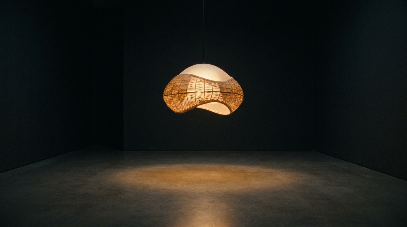

Iryna Koval runs Svitlo, a small lighting and furniture studio tucked into a converted warehouse on Podil. She called in March with a problem: a trade fair in Valencia was five weeks out, and the studio’s old site still showed a product line they had discontinued two years earlier. She didn’t want a deck of options. She wanted a site, and she wanted it fast.
The brief from Svitlo
The brief itself fit on half a page. Eleven lamp series, four finishes each, one contact form, and a PDF catalogue that needed to open without crashing on a trade fair wifi connection. It needed no blog and no shop, and nothing would move just to move. Iryna sent us forty product photos shot by Taras Melnyk, all on the same grey backdrop, already colour corrected.
Normally we’d have spent a week turning that brief into a Figma file with three homepage directions and two type pairings. This time we didn’t. We told Iryna we’d show her something working within four days instead, and that we’d adjust from there.
Why we skipped the mock-up stage
The cost of a 40-screen Figma file
On the last project of this size, the Figma file grew to 38 frames before a single line of code existed. Three review rounds later, half of those frames had never made it into the build. Clients approve static comps against static expectations, then the comps meet real content, real line breaks, real loading states, and everything shifts anyway.
What the client actually needed to see
Iryna didn’t need to see a mood board. She needed to know whether the grid of eleven lamp series would feel calm or cluttered at actual browser width, on her own laptop, with her own photos. That question only gets answered in a browser.
Building in the browser
So we opened a blank Astro project and started with the product grid, using Rui’s real photos from the first commit. No lorem ipsum, no placeholder grey boxes. We set a 12-column layout, picked a single variable font, Suisse Int’l, and let the spacing come from an 8-point scale instead of eyeballing it.
By day two there was a homepage and one product page live on a Vercel preview link, sent straight to Iryna’s phone. She replied within the hour with two notes: the finish swatches looked like paint chips, and the contact form sat too close to the footer.
- Day 1: grid, type scale, colour tokens pulled from the product photography
- Day 2: homepage and one full product page on a shareable preview URL
- Day 3: all eleven product pages templated from a single Astro layout
- Day 4: contact form, catalogue download, first full review call
The first review call
We did the review over a screen share, scrolling through the live preview rather than clicking between static frames. Iryna caught things a comp would never have shown her: the way the Dnipro lamp series photos were slightly warmer in tone than the Karpaty series, which made the grid feel uneven once real images sat side by side.
We didn’t need to imagine the site anymore. We were just telling you what was wrong with the actual thing.
That call lasted twenty-two minutes. The equivalent call on the previous project, reviewing a Figma prototype, had run past ninety minutes and ended with a list of nineteen open questions, most of which were really questions about content rather than design.
What changed after week two
By the end of week two the site had gone through three revision rounds instead of the usual six, and every round had been against working code. Iryna asked for one structural change, moving the catalogue download above the product grid on mobile, and we could make it and send a new link within the hour rather than redrawing a frame and waiting for approval before touching anything real.
The site shipped nine days before the Valencia fair, with time left over to fix a Safari rendering bug in the finish swatches that nobody would have caught in a design file at all.
What we’d do differently now
This approach works because Svitlo’s brief was narrow and the content already existed in near-final form. We wouldn’t skip Figma entirely for a project with five stakeholders and no fixed photography, where alignment on direction matters more than speed. But for a studio that already knows what it sells and needs to see it live, building straight into the browser removed a whole stage of translation that was never adding anything except delay.



Leave a Reply